
Archive | Blog
The History of Data Visualization
The area of data visualization is growing at an incredible rate. Today we can visualize vast quantities of data on a single graph, something that simply couldn’t be done several years ago due to lack of computing power.
Today we have tools that can animate our data sets, providing us with incredible visualizations showing our changing data plots over time. These animations begin to tell a story and one can begin to extract meaningful information from the underlying data set.
If you don’t believe me, take a look at one of Hans Rosling’s presentations on TED or YouTube. It is time well spent!
But despite all the advances, data visualization has been used for over 150 years!
One of the earliest examples was John Snow’s (no, not Game Of Thrones John Snow, or the Hunger Games Jon Snow!), graphical representation of Cholera outbreaks in London during the year 1854. By plotting the outbreaks of Cholera on a Central London map, Mr Snow was able to pinpoint the source of the outbreak to a specific water pump.
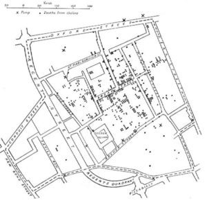
SAP has written an interesting article which mentions this visualization, and several others, which is well worth a read.
Hans Rosling
Saddened to hear today that the great data visionary and educator, Hans Rosling, has died, aged 68.
For those of you not familiar with Hans Rosling, Hans was a leader in the data space and was well known and highly regarded for his animated and incredibly interesting presentations using data and animation.
He helped develop some very clever data visualisation software (Gapminder Foundation) and used this to wow his audiences with data and statistics.
One of several fascinating presentations can be seen here:
A data visualisation pioneer.
RIP Hans Rosling.